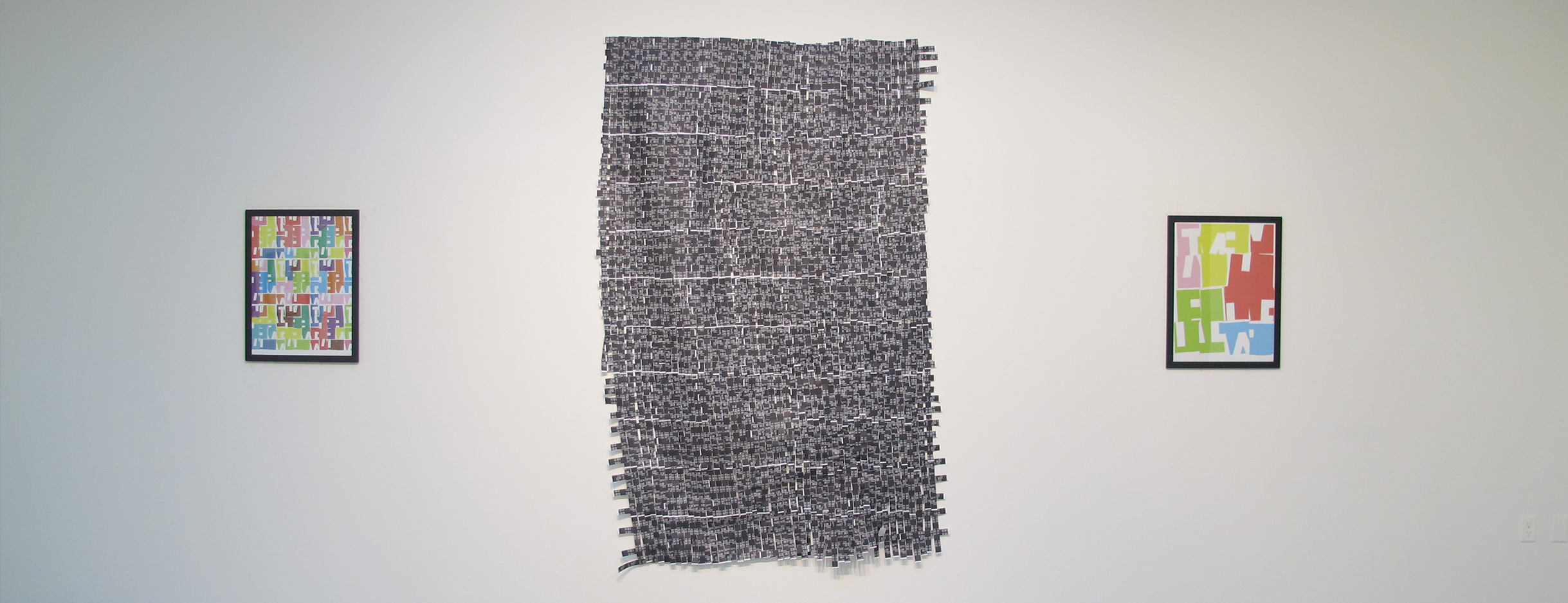
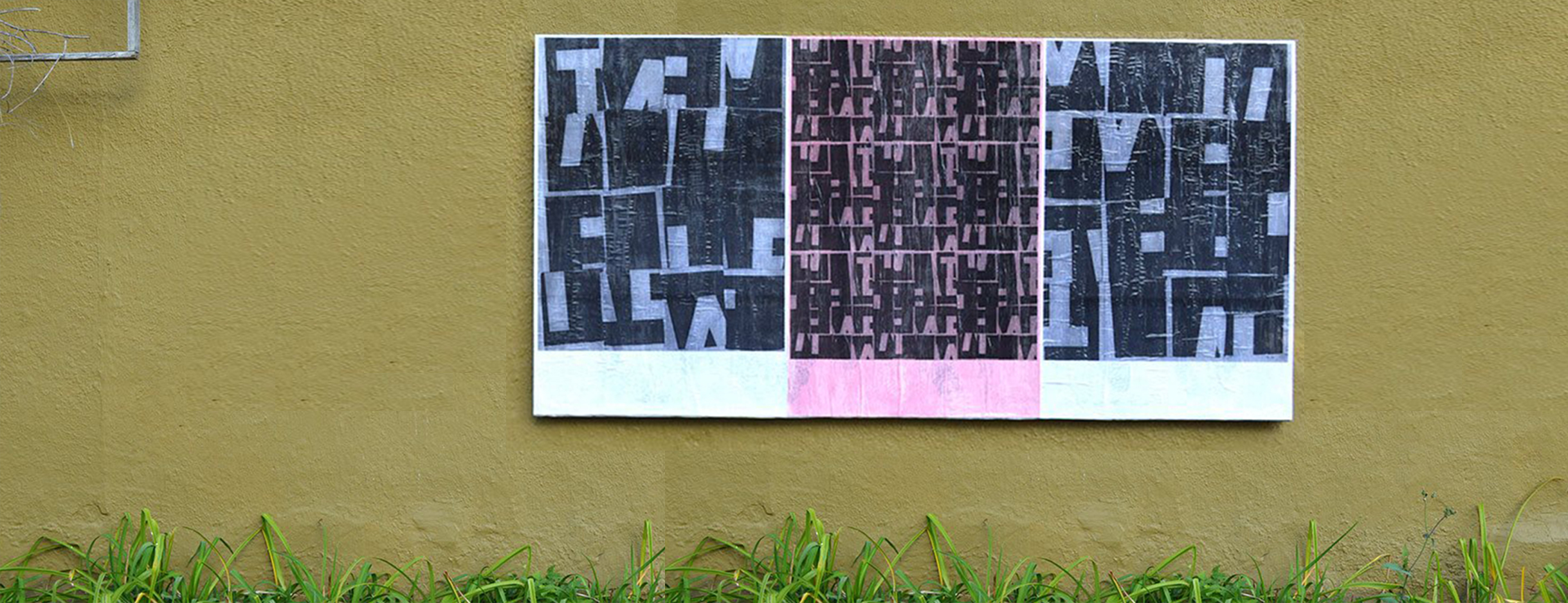
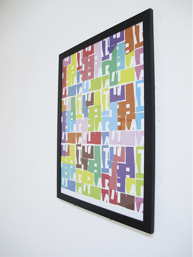
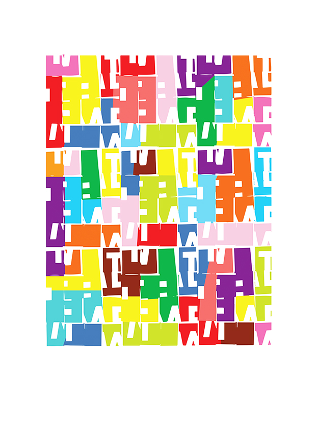
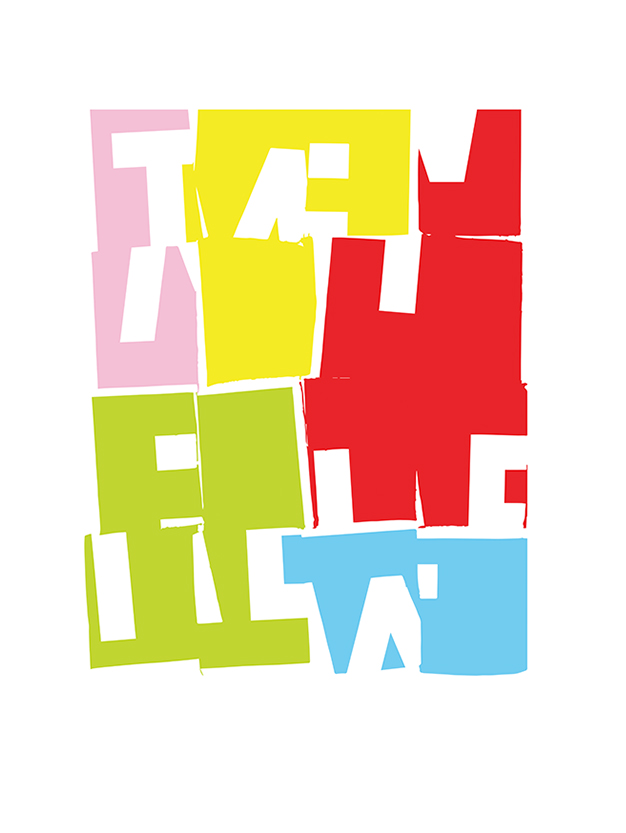
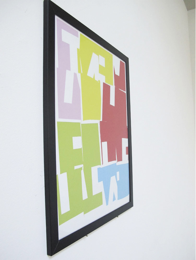
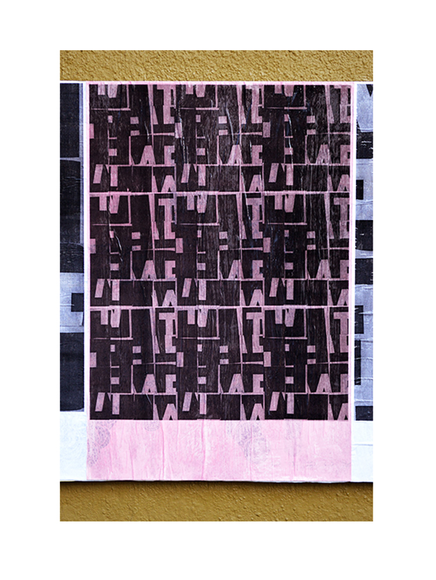
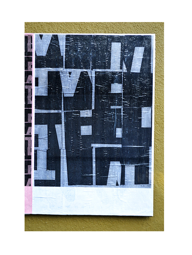
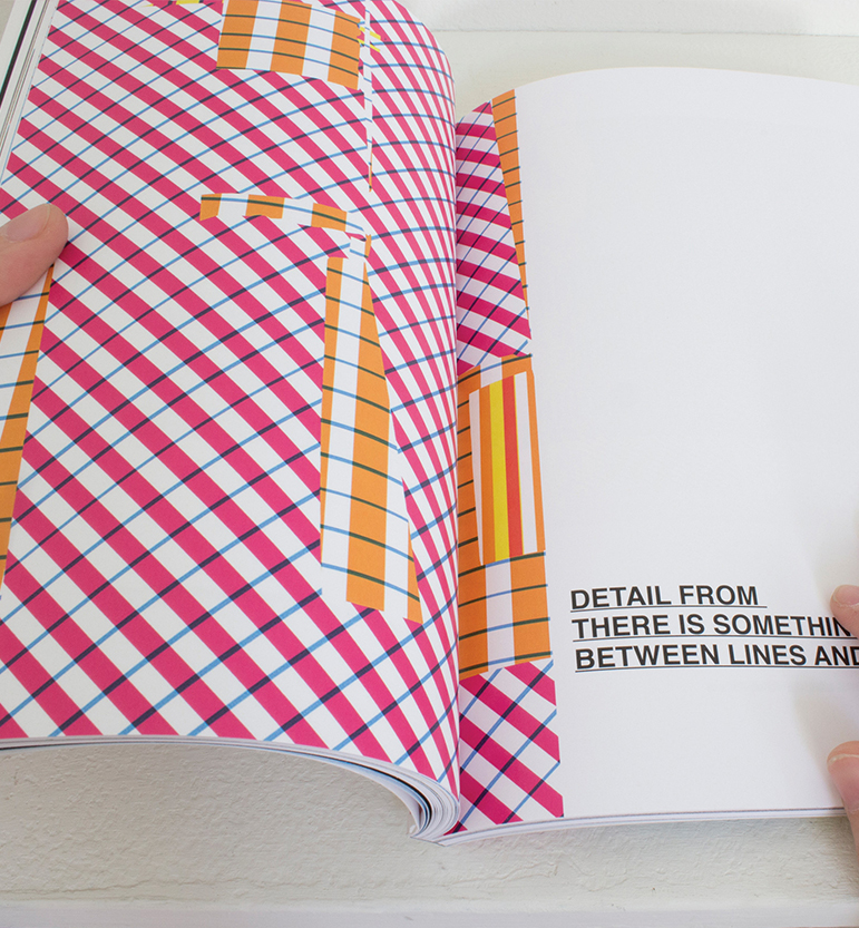
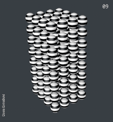
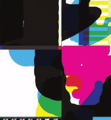
What is, what isn’t is a series of works explore the relationships between legibility and illegibility: typographic shape as image. In this project, graphic elements (shapes, color, pattern, type) are constructed, deconstructed and then reconstructed in order to create a richer experience and extend their meaning. As a designer, I understand the need for legibility, but I am more concerned with communicating something more visceral, expressive, and imaginative.
| Date: | 2015 |
| Category: | Self Project |